
 202 Products in 18 Families
 Packaging Built Around the Buyer
 From Brief to Approved Sample
 Cosmetic Packaging Buyer Guide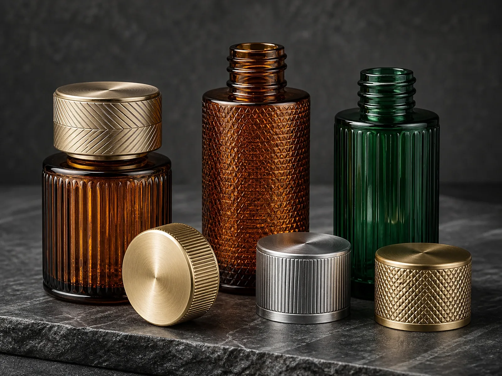
Direct answer
Minimalist Packaging Design: Less Is More
Minimalist packaging is precise rather than empty. Proportion, closure integration, controlled color, legible artwork and tactile finish must carry the brand without relying on many decorative processes.
The practical decision still depends on the actual formula, packaging structure, production process, destination market, quantity and brand position. Treat editorial content as a way to improve the brief, not as universal approval of a material or product.
Buyer Takeaways
- Reduce competing focal points
- Coordinate cap, pump and bottle proportions
- Use one finish intentionally
- Check legibility and regulatory space early
Decision Table
| Direction | What to evaluate | Evidence or output |
|---|---|---|
| Shape | Silhouette and shelf recognition | Physical scale sample |
| Color/finish | One controlled visual signature | Substrate-specific limit sample |
| Artwork | Hierarchy, legibility and print process | Production-size proof |
Evidence and Responsibility
Request information for the exact product code, material, manufacturing entity and process. Generic declarations, empty-pack tests and photographs have limits. The brand, filler or responsible party should validate the final filled package and market-facing claims.
Terms such as “FDA approved,” “compatible with all formulas,” “fully recyclable” or “eco-friendly” require precise scope, current evidence and market context.
Frequently Asked Questions
Does minimalist packaging cost less?
Not necessarily. Precise surfaces, tight color control or premium components can still require significant process control.
How many finishes should be used?
Use only those that support a clear hierarchy and can be approved and repeated reliably.
Can a label look premium?
Yes, when material, adhesive, edge, application, print and the container surface are designed together.
Recommended Next Step
Continue with the product, test or sourcing page that matches this decision.